

Numbers are powerful, but let’s be honest—they can be overwhelming on their own. That’s where Excel charts come to the rescue! By visualizing your data with charts and graphs, you can turn complex datasets into clear, digestible insights. In this blog, we’ll explore different types of charts, learn how to create and customize them, and discover tips for making them stand out.
Charts help you see patterns, trends, and comparisons at a glance. They make your data:
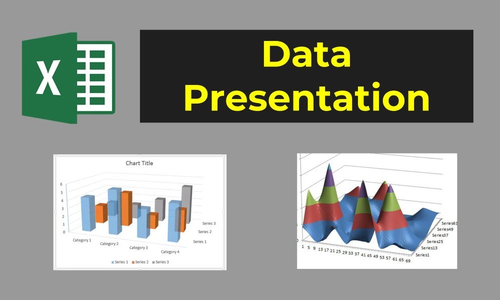
Excel offers a wide variety of charts, each suited to different types of data. Here are some common ones:
Column Charts: Best for comparing values across categories. Example: Sales revenue for different products.
Bar Charts: Similar to column charts but horizontal—great for visualizing long category names.
Line Charts: Ideal for showing trends over time. Example: Monthly website traffic.
Pie Charts: Perfect for illustrating proportions and percentages. Example: Market share by company.
Scatter Plots: Used for identifying relationships between two variables. Example: Advertising spend vs. sales revenue.
Here’s a step-by-step guide to creating your first chart:
Select Your Data: Highlight the range of cells you want to include in the chart. Make sure to include headers for clarity.
Insert the Chart:
Customize Your Chart:
A good chart isn’t just functional—it’s visually appealing. Here are some ways to customize your chart:
Add Titles and Labels: Give your chart a clear title and label the axes for context.
Highlight Key Data: Use colors or markers to draw attention to important points.
Choose the Right Chart Type: If your chart feels confusing, consider switching to a different type.
Simplify: Remove unnecessary elements (like gridlines) to make your chart cleaner.
Imagine you’re tracking monthly sales for different products. Here’s how you can create a visual that tells a compelling story:
With this chart, you can instantly see which products are performing best and identify seasonal trends.
Here are some tips to make your charts both informative and visually stunning:
Creating charts in Excel isn’t just about making your spreadsheets look nice—it’s about communicating your data in a way that drives action. By mastering the art of chart creation and customization, you’ll be able to tell compelling stories with your data.
In our next blog, we’ll explore PivotTables, one of Excel’s most powerful tools for summarizing and analyzing data. Stay tuned for more Excel magic!