

When you’re dealing with large datasets, sifting through rows and columns for insights can feel daunting. Enter PivotTables—the ultimate tool for summarizing, analyzing, and organizing data. Whether you’re managing sales numbers, tracking expenses, or analyzing survey responses, PivotTables help you make sense of complex data with just a few clicks.
Let’s explore what PivotTables are, how to create them, and why they’re a game-changer for anyone working in Excel.
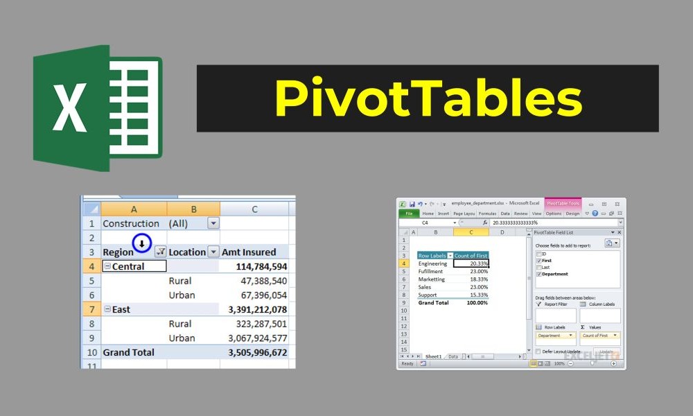
A PivotTable is a dynamic tool in Excel that allows you to quickly summarize and reorganize your data. It works by “pivoting” your data to display it in different perspectives, focusing on what’s relevant.
Why Use PivotTables?
Creating a PivotTable is easier than you think! Follow these steps:
Step 1: Prepare Your Data
Step 2: Insert a PivotTable
Step 3: Build Your PivotTable
PivotTables are incredibly flexible—you can adjust them to fit your needs. Here’s how:
Change Calculation Types: By default, values are summed, but you can change this to averages, counts, or percentages. Right-click a value field, select Value Field Settings, and choose your calculation type.
Sort and Filter Data: Use filters to focus on specific categories or sort rows/columns to highlight trends.
Add a Pivot Chart: Visualize your PivotTable data by inserting a chart. Go to PivotTable Analyze > PivotChart.
Imagine you’re managing a spreadsheet with thousands of sales transactions. Each row includes:
With a PivotTable, you can:
Example:
Within seconds, you’ll have a clear overview of your sales performance!
Make the most of PivotTables with these helpful tips:
PivotTables are more than just a fancy tool—they’re your key to unlocking valuable insights from complex datasets. Whether you’re summarizing sales, analyzing survey responses, or tracking budgets, mastering PivotTables will revolutionize the way you work with data.
In the next blog, we’ll explore Excel automation with macros, diving into how you can save time and boost productivity. Stay tuned for more Excel magic!